Behind the Design: Automate the Suck Out of Life
A deep dive into the branding, design, and development process behind Automate the Suck Out of Life's new website.

The Beginning
I have spent my whole twenties trying to figure out this whole “adulting” thing, and if I have heard one common sentiment of my fellow zillenials, it is this: It sucks.
Of course, there are amazing things that come with being an adult, but you never realize how much more of your life is taken up by “adulting” tasks until you’re out of the house and doing it on your own. (Did you know you need to clean your cleaning machines??)
My husband, Dylan, and I have been navigating life together since our early twenties and have taken on these new “adulting” tasks together. We always found ourselves thinking, “How do people do this?” Or rather, “How do people do this and still have time for all of the things they actually want to do?”
We discovered that truly wealthy people often hire out for the tasks they don’t want to put their time towards. For some, their time is a more finite resource than money, so they put their money towards hiring people to do the tasks that take up too much of their time (cleaning, financial planning, laundry, cooking, etc.).
Dylan and I wanted to experience the luxuries of not having to do “adulting” tasks and made it our personal mission to automate, or at least streamline, as many of these tedious tasks as possible. As we started making these improvements in our own lives, we wanted to share our findings and help others find their own ways of reclaiming their time.
This brought us to founding our nonprofit, Automate the Suck Out of Life.
We are so excited to share more of our story and create more resources as we continue our work. I wanted to kick off our new site with a behind-the-scenes look at the design and development process.
Behind the Design
What’s in a Name?
The design process truly started when Dylan and I came up with the name. We are both huge fans of Hank and John Green (DFTBA, Nerdfighteria!) and have been incredibly inspired by their work. They founded The Foundation to Decrease World Suck, a charity-driven initiative to make the world a better place.
While chatting about our dreams for ATSOL, Dylan said, “I kinda want to call it Automate the Suck Out of Life.” I loved it—straight to the point, a little edgy (kinda sounds like automate the f** out of life* hehe), and perfectly aligned with our mission.
Logo and Wordmark
I started the visual design by experimenting in Canva. I played with different arrangements of “Automate the Suck Out of Life” and refined the spacing and sizing until it felt balanced.
The Robot Vacuum Inspiration
Dylan and I have introduced a lot of automation into our daily routines, and one of the first real game-changers was our robot vacuum. When we lived in our first apartment, vacuuming was a constant task. When we finally got a Roomba (which we lovingly named Succ), I realized how much mental space and time I had freed up by automating just one task.
That experience was pivotal, and I wanted to represent that feeling in our brand identity. That’s why I started designing a simple robot vacuum icon.
Incorporating the Lightning Bolt
As I refined the logo, I wanted to introduce an additional visual element that represented power, speed, and automation. After brainstorming different symbols—including a spiral (representing suction) and a magic wand (symbolizing effortless transformation)—I landed on the lightning bolt.
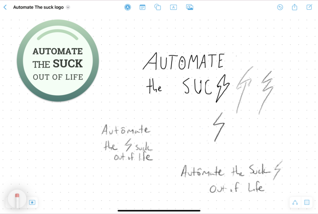
The lightning bolt felt like the perfect symbol for the energy and efficiency of automation. It also had a personal connection—Dylan and I had been re-reading Harry Potter, and the lightning bolt became a small nod to that, as well as a reference to electricity and technology powering automation. Plus, one of our favorite songs that year, Monster by Yung Lean, had lightning imagery in its lyrics, which just felt right for our branding. Once I finalized the lightning bolt as a key design element, I explored different ways to integrate it into the wordmark and accompanying iconography. I played with different placements in Freeform on my iPad before finalizing the design in Canva and Figma.
Color Palette & Typography
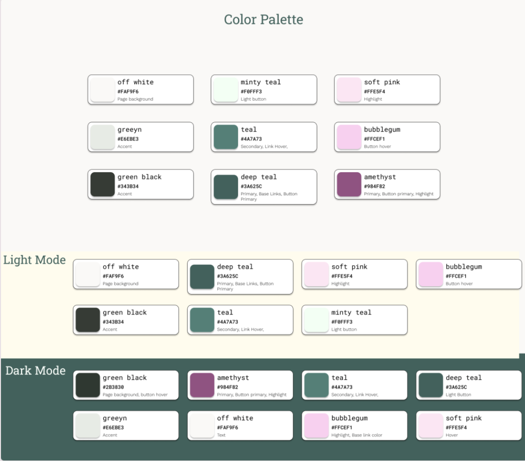
I chose a green color palette because I wanted our brand to feel modern, clean, and approachable. Our goal is to empower people to use technology to improve their lives, so I wanted the branding to feel practical and DIY-friendly.
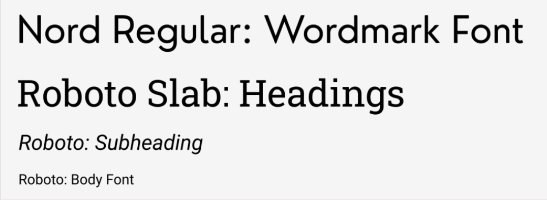
Typography choices:
- Nourd (sans-serif): Clean and modern for the wordmark.
- Roboto Slab: Used for headings to add some structure.
- Roboto (sans-serif): Readable, professional body text.
- Roboto Mono: A monospaced font for accents like buttons.
Building the Website
Tech Stack & Implementation
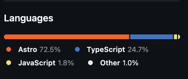
Once I finalized the designs in Figma, I moved to development using:
- Astro (Framework)
- CSS (Styling)
- JavaScript & TypeScript (Interactivity & Logic)
I leveraged Cursor AI to streamline my coding process. Instead of writing everything from scratch, I used Cursor to generate boilerplate code, debug issues, and refine styling. This significantly reduced development time and helped me focus on user experience.
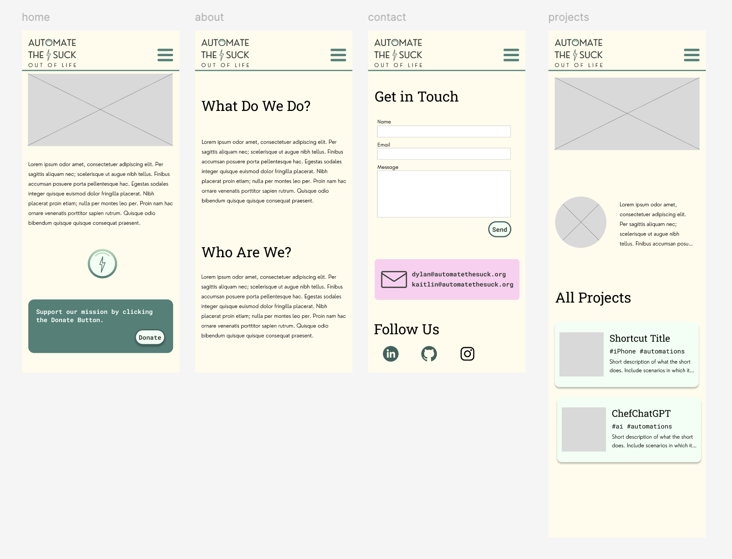
Mobile-First Design
Given that most users access websites on mobile first, I prioritized mobile-first design:
- Readability: Ensuring clear typography and accessible contrast.
- Navigation: Keeping the menu intuitive and easy to use on smaller screens.
- Performance: Optimizing load times with lightweight assets and efficient code.
Final Thoughts
One of my favorite elements of the design is the hero section, where our Roomba-inspired logo “sucks up” dirt elements (represented by an asterisk ✱ as a nod to the Forever Notes Framework). This animation ties the branding and functionality together in an engaging way.
Building this site was an incredibly fun experience, and I love that the branding turned out to be both creative and professional. I’m excited to continue growing Automate the Suck Out of Life and sharing more projects in the future.
Want to Support Us?
- Follow us on GitHub, LinkedIn, Instagram, and Bluesky.
- Check out the live site here.
- Let me know your thoughts—I’d love your feedback!
Additional Resources
